

Axure RP 10 installation and license purchase
Extended reading: Understanding the new features of Axure RP 10
Axure RP 10 has introduced new features that are a huge improvement over Axure 9. The improvements of these features are introduced on the official website, but there is no detailed explanation on the feature and use scenario. With images, you can understand these updates faster. Let's dig deeper.
Panels
· New All States View to see and edit all panel states side by side
This feature is a huge improvement over other RP versions. It allows us to and edit the states of all dynamic panels at the same time. Just like the canvas in Figma and Sketch. This is a great advantage for designing the motion effect of the app. Like the following apps, you can use this feature to design the dynamic effect of APP page switching.
Click the Tottom Tool/tab bar Icons to view effects
This effect can be easily designed by viewing all dynamic panel feature:

· Start and stop editing panels with a single click
Unlike other versions of Axure, in 10, you only need to click the dynamic panel to enter the editing state, which improves efficiency.

· Drag widgets from canvas and drop into any panel state
· Drag widgets from any panel state and move out to canvas
You just need to hold the shortcut key option + command to drag components on the canvas into and out of the dynamic panel, which improves efficiency.

· View and quickly navigate to parent panels from canvas
You just need to click the return button in the upper left corner of the canvas to return to the parent panel.

Constraints
· Apply constraints to widgets within groups
· Ability to pin to left, right, top, bottom, middle or center
· Ability to fix width and/or height
· Import constraint rules from Sketch, Figma & XD
By adding constraints, you can limit the size or position of widgets in the group, so that when you adjust the size or position of the whole group, the properties of the widgets with constraints remain unchanged.
By importing the constraints of UI design tools, such as sigma, sketch and XD, you can combine UI and UX design, which is also the development trend of Axure RP.

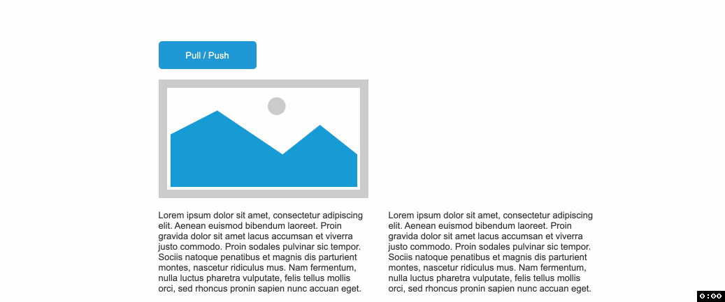
Push/Pull
· Ability to customize push/pull distance

· Push/pull widgets based on size change of panel
In addition to pull/push the widgets by showing / hiding widgets, you can now pull/push the widgets by changing the size of different dynamic panel states. This is very efficient for making widgets such as accordion.

· Push/Pull entire groups rather than individual widgets in the group
Unlike previous versions of RP 10, entire group can now be pushed, even if widgets in a group are not in a row.
· Move actions can now move all widgets below or to the right of a widget
Very convenient feature. Now you can move the below or right widgets of the specified widget.

Repeaters
· Ability to select widgets and automatically convert them to a repeater
Right click to select convert to repeater item.

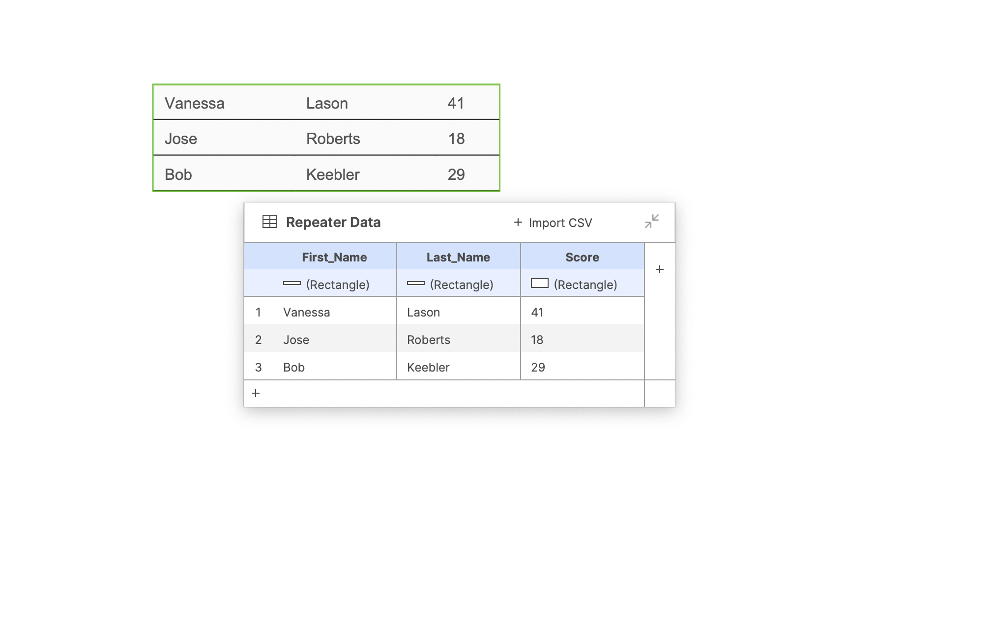
· New feature to intuitively connect widgets to data columns
· New floating data editor giving you more space to view and edit data
In RP 10, the repeater changes greatly by placing the control area and data area on the canvas and connecting them. Users can simply operate the data and view the results. This mode is similar to the table data feature of PowerPoint.
· Automatically resize repeaters items to content including widgets that fit to text
If you check the fit to content option, the item size will change according to the data. If you don't check this option, the item will be the size of the component.

Selected

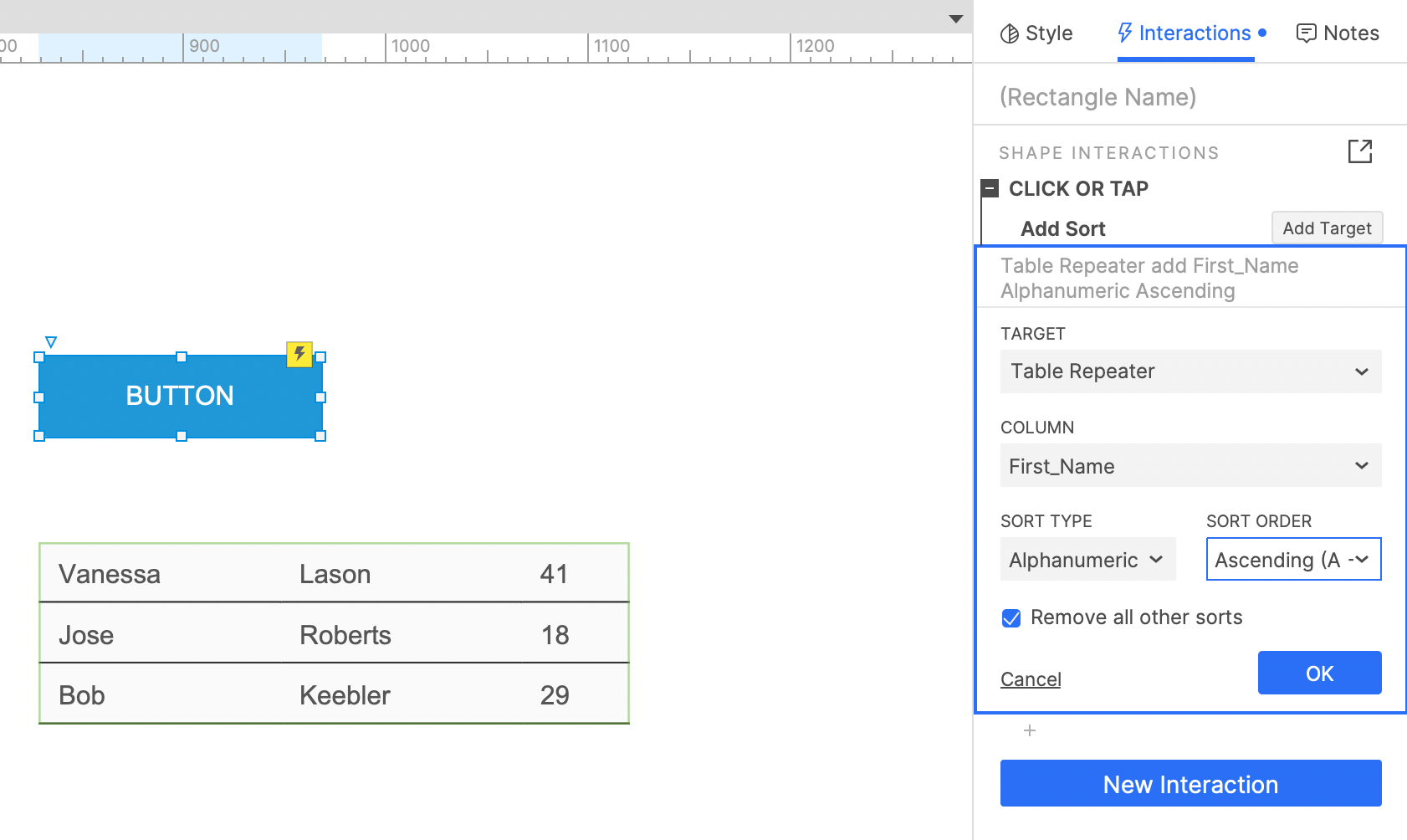
· Quickly add sorting with new options to sort alphanumerically and remove other sorts
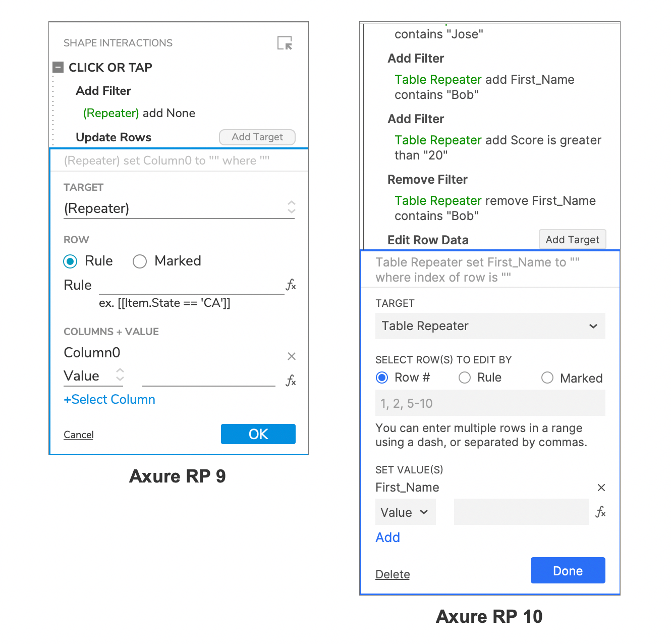
· Add filters with a new, simpler option to select columns and define criteria

· Ability to filter by satisfying ANY of the added filters (in addition to ALL)
· Smart filter option that enables creating multi-faceted filters
If you do not check the remove other filters option, you can use it in combination with other filters. Check match any to filter the items that meet any filter. Select match all to filter the items that meet all the filters. Select smart to filter the items that meet any filters in the same column and meet all filters across other columns.

· Easier to select filters and sorts to remove

· New feature to update data by row numbers
Condition Builder
· Easier way to add conditions before actions

· Common conditions like “if field is empty” and “if field contains @”

· New condition to check whether a widget is in an error state

Forms
· New Error style effect and “Set Error State” action for form fields

· Common conditions like “if field is empty” and “if field contains @”

· Ability to trigger interactions when a widget is set to an error state 
· Checkboxes and radio buttons can be set to fit to text

· Option to toggle between the enabled and disabled state of a widget with a single interaction

0 comments